Does your website suck? Are you sure? What are the bounce rates? How often are people engaging with your calls-to-action? What’s your traffic like on desktop and mobile?
To be honest, we could continue with an entire list of questions like this regarding your website and its current design. If you’re here, then obviously you have some concerns about your site and want to know why your audience and customers hate it.
We can’t pinpoint exactly what’s wrong with your site regarding your customers — every group and brand are different. Only you have the power to figure that out. That said, we can go over eight common design problems with modern sites to give you the knowledge to discover where your faults lie.
-
Old or Outdated Content
Two things will slaughter traffic to your site, especially from return visitors. One of them is not updating your content or news feed consistently. The other is hosting old or outdated content.
There’s a reason why blogs and news portals update with new content on a regular basis. Fresh, interesting material is what keeps audiences coming back. It’s the same reason you launch new products or release revisions to old ones. Somewhere — anywhere really — on your site there must be an area dedicated to fresh, engaging and relevant content. More importantly, you must have the resources and personnel to update regularly.
Modern SEO experts behind the Moz team offer an excellent example of this in action on their official blog. To keep their audience interested and coming back, they deliver fresh, engaging content from a variety of professionals and marketing experts in the industry.

-
No Mobile Support
We’re way past the point of no return when it comes to mobile support and responsive design. Mobile users have already surpassed desktop users in the amount of time and traffic they deliver across the web. You can’t ignore mobile users, period.
Worse than no mobile support is, believe it or not, aggravating or shoddy support. You want your website, images, elements, navigation and content to scale well to smaller displays. One way to ensure this is to deliver a responsive design that automatically shifts and adjusts according to the resolution of whatever device is being used.
Another technique is to design your main site from the ground up with mobile users in mind. Whatever the case, don’t overlook mobile support for your audience. If you do, you’re going to lose a lot of business.
This Clopay Doors comparison page and toolset work the same on both desktop and mobile, allowing customers full control no matter what device they’re using.

-
Slow or Sluggish Performance
No one wants to waste time sitting around waiting for a website to load on desktop or mobile. You could argue slow performance is worse for mobile users, who are often browsing on-the-go and want to get in and out as fast as possible.
But there’s more to it than just an unfortunate experience delivered to your audience. Google and similar search engines penalize you byranking you lower in search resultsif the performance of your site suffers. That means it can also directly affect the amount of referral traffic landing on your site.
Do everything you can to optimize the loading times and performance of your site. Compress or optimize images, so they load faster. Deploy cache or backup systems for your CMS platform —WP Super Cache is an excellent choice for WordPress users.
There are many ways to achieve optimal performance.Some are easier than others, but it doesn’t matter how you deploy them. All that matters is that your site is responsive and reliable. Make it happen.
A lot is going on withWimDelvoye’s professional portfolio.Despite all that, the site performs beautifully even on mobile.

-
Lack of or Poor Visuals
Back when mobile first appeared, web designers and developers had to bridge the gap between delivering attractive and visually arresting desktop sites, and optimized mobile-friendly ones. That’s no longer the case, especially since your average smartphone or mobile display can show full-HD content.
In fact, audiences tend to prefer visual content, which is why social media networks are so popular. Make sure you deliver engaging, attractive imagery such as product images, background page content, galleries, designer elements, dividers and much more.
Make your website sing like a proverbial canary!Any visit to Airbnb’s site is visually arresting— follow their lead.

-
Grammar and Contextual Errors
It’s 2017. There are a plethora of spell-checking apps and services, such as Grammarly. There’s absolutely no reason to be making egregious spelling or contextual errors across social media updates, posts, infographics, visuals or text content.
Do what you can to eliminate errors. Contextually, research everything before publishing or updating your content and make sure what you’re saying is appropriate and accurate. There are plenty of resources at your disposal to ensure this, so take advantage of them.
Just imagine an attractive news site like Digiday or Engadget that’s rife with spelling errors and contextual problems. It wouldn’t look so great, would it?

-
Mirrored Content
Every single page or post on your website or company blog should be unique. Don’t mirror or clone content for use on additional pages. Not only is this bad for search engines and optimization, but it’s also unprofessional and unsightly to most customers and visitors.
If you visit a site that has the same content on every page, eventually you’re going to catch on and stop moving around. You’ll either stay put or leave the site entirely, and that’s no good for anyone.
Although the site isn’t text based, film studio A24 does an excellent job showcasing their work in a unique, engaging way. Not to mention, every page has content that makes it worth viewing.

-
Lengthy, Complicated Forms
Forms are great. They allow you to extract important details and information from your audience and store it for use later. But a lot of times, designers and developers get carried away when creating them. Lengthy, complicated forms are never fun to interact with and can be downright excruciating. Worse yet, try powering through a super long form only to have a connection, browser or computer error and lose all your work. Chances are you’re not going to return to continue after something like that.
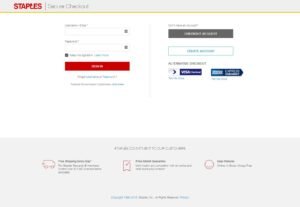
Keep any forms you deploy short and sweet, including your contact or order form. Staples, for example, incentivizes the need to be logged-in during checkout, by offering a “guest” account option. In other words, if you don’t want to go through the trouble of signing in or signing up for a new account, you don’t have to.

-
Precise, Reliable Navigation
There’s a seemingly endless supply of navigation designs and elements. You can make your menu look, act and feel any way you want. Whatever you decide to do, make sure it’s always clear and reliable. Provide access to the most relevant pages and content first. Make sure all navigation elements and options take you to the right portal. Confirm the system works on both desktop and mobile. More importantly, verify it works as intended.
Customers and audiences will come to your site from a variety of places. If you want them to stay and move around internally, you need to ensure they have a straightforward way of doing so.Ditch traditional menu and navigation bars entirely,like Ellevest has done, and include everything in a simple, minimalized form. It makes things more attractive and easier to use.

Without applying the tips above, your website is going to fall to pieces in minutes — if not seconds. There are many ways to ruin a site design and only a handful of ways to get things right. Learn your lesson early and make sure you offer your audience exactly what they’re looking for as soon as possible — starting like, right now.
Leave a Reply