Somewhere there is a graphic designer who is reading the title of this post and silently praying to themselves, “Please don’t let it be me.” Still, the truth must be told: Some redesigns were epic failures. You can imagine the scenario: Some new executive who wants to “shake things up” calls in a creative team. Instead of changing the product — Remember New Coke? — they figure changing the logo is a safe move to freshen things up and move the brand into the 21st Century. What could go wrong? Plenty of things, as these five infamous examples of failed -redesigns reveal:
Tropicana Orange Juice

When Google came out with their new design, it gave plenty of people pause. Some really hated the new Google logo; I sure did. However, nothing can compare to the rage sparked by grocery shoppers when their favorite brand of OJ decided to monkey around with their design.
The classic Tropicana design featured an orange with a straw stuck right in the fruit. It was bold, simple and eye-catching. See how fresh Tropicana is? It’s like drinking an orange right off the tree.
Why would anyone want to mess with that? Well, the good folks at PepsiCo who bought Tropicana thought a carton with no pictures of the orange and just the words “100 Percent Orange Juice” would do the trick. Customers thought the new box looked like a generic bargain brand or just downright “stupid.” Yikes! After only a month, PepsiCo switched the design back.
So what you can learn from Tropicanas redesign failure?
Digg

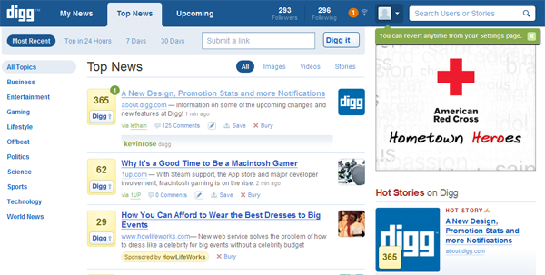
Digg is a social news aggregator site. That’s a fancy way of saying a place for trending topics — like Reddit but with less clutter. At least, that is what it was when it launched: Viewers could pop over to Digg and see at a glance what everyone was buzzing about.
However, the brain trust at Digg thought the site should become more than a social news aggregator site: It should also become a social media site. The new Digg encouraged users to create their own trending new columns to share with their friends, like Facebook. It even got a design overhaul that looked a lot like… Facebook. Only it wasn’t Facebook.
Adapting the redesign would have been like restarting your Facebook profile on another site and then hoping every one of your Facebook friends joined that site, too. That didn’t happen. By some estimates, Digg lost about 26 percent of its traffic, a huge hit by anyone’s measure.
Thankfully, Digg went back to the original design, but by then it was already too late. The damage had been done. They never truly recovered, and today Digg is a shell of the news aggregation giant it once was.
GAP

Building a brand takes a while. There is nothing wrong with tweaking a design: Kentucky Fried Chicken has gotten a positive result for their rebranding of the Colonel in a friendly apron on their jaunty new logo. They also avoided the actual term “fried chicken” by turning their official name into the letters KFC — even though we all know what they’re selling.
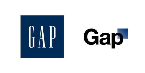
The GAP’s classic “blue box with white lettering” design had been representing the company for 20 years. Once again, the head honchos mistakenly decided that their design needed a change.
The new GAP logo was designed by Laird & Partners and it featured a different font (sans serif) and different coloring for the letters, relying on black instead of white. The blue box was shrunk and plopped in the corner of the “P.” The real “gap” was between those designers and the loyal customers.
Trying to save face, the company covered up the change by implying it was a “social experiment.” They then asked customers if they had any suggestions for a new logo. That is one can of worms you do not ever want to open! GAP flipped back to their old logo and fired their president.
Pepsi

Pepsi went through an interesting redesign phase. In fact, it appears that Pepsi is constantly redesigning its logo while Coke’s has remained virtually untouched. For their latest “improvement,” Pepsi turned to the Arnell Group, which took the red, white and blue ball and put it on a slight angle. Then they puffed up the white stripe to make it look like it just had a collagen injection.
According to reports, this redesign took five months to complete and cost close to a million dollars. I’m sure you wish you could have been in the boardroom when they unveiled that logo and slipped the bill across the table. Money well spent? I’m sure the design team thought so!
SyFy

Before the SyFy Channel became the SyFy Channel, it was the SciFi Channel. The channel is a niche outlet for all science fiction, fantasy and paranormal television — a place for geeks and nerds. Nothing’s wrong with that — being a geek or a nerd is cool, especially when you consider the popularity of shows like “The Walking Dead” or “Game of Thrones.” The network decided they would take their shot at being cool, too. Thus, the channel was rebranded as SyFy. So cool.
The message of the new title appeared to be that they are sci-fi but they’re not sci-fi, so if you’re not into sci-fi you can still watch SyFy. In other words, they did a bang-up job of alienating their core audience, and confusing everyone else. Unlike the other companies mentioned in this post, SyFy is sticking to their phasers. They’re not changing the name or the logo.
If you happen to be working for a company who is handed a huge contract to redesign an established logo, I will offer two words of advice: Focus groups. Before you decide exactly what this new thing is going to look like, bring in some of the end users and get their opinion. This will mean putting aside any egos and listening to that one entity that is always right: the customer.
About the Awesome Contributor:
Adrienne Erin is a freelance designer who blogs at Design Roast. See more of her work by following @adrienneerin on Twitter.
That's correct Raj.