
Today, responsive websites have become a standard for attaining a unique niche in the web world. There’s a good majority of people which is switching from desktop devices to smartphones and tablets in order to access multiple websites available over the internet. In-line with the growing usage of mobile technology, it becomes imperative to optimize your website for mobile devices. A website which renders an easy navigation on mobile devices is the one which is capable of grabbing the attention of targeted customers. Being regarded as one of the vital elements in responsive design, mobile navigation is worth investing your time and efforts. This post will make you familiar with some popular responsive/mobile navigation trends which can take your website to a new level of success.
Responsive Navigation menus- A look at their types
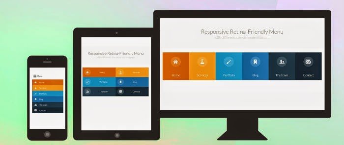
Responsive retina-friendly menu
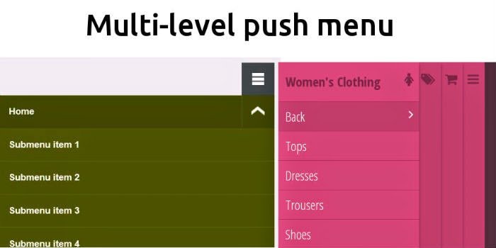
Multi-level Push menu
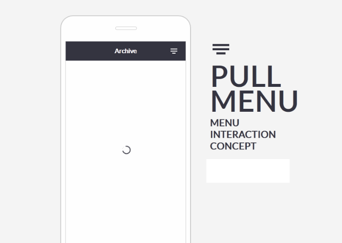
The Pull Down menu
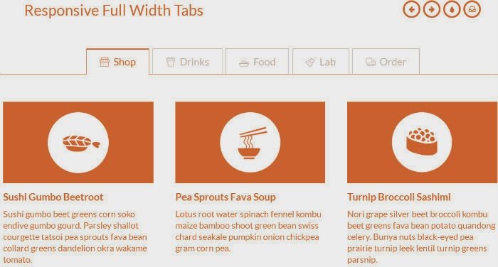
Responsive Full width tabs
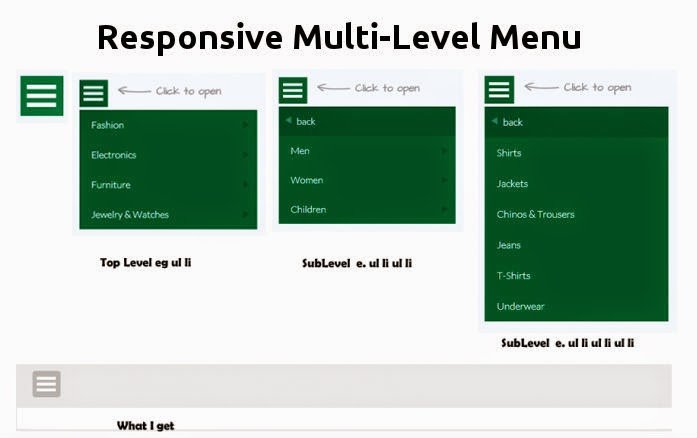
Responsive multi-level menu
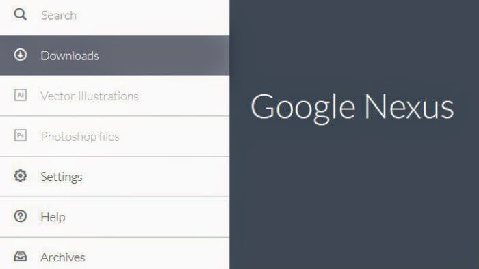
Google Nexus Website Menu
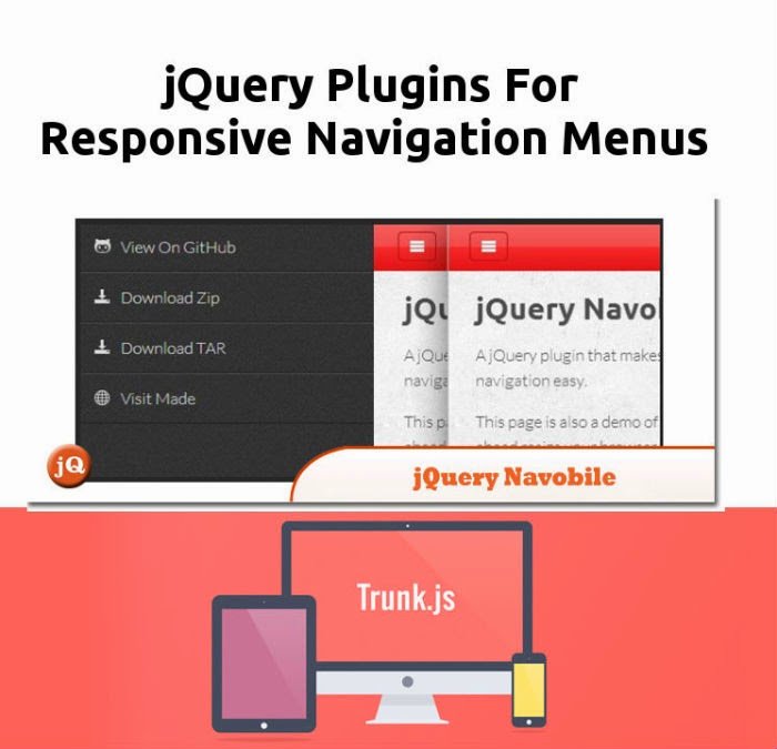
Trunk.js
jQuery Navobile
This is a jQuery plugin which makes mobile navigation easy. jQuery Navobile uses CSS for applying multiple CSS3 translations, fixing the position of nav and also for mobile device detection. This jQuery plugin comes with a few events that you can bind to. The same are explained below:
- navobile:open- this event is fired when navobile is hidden and navigation cta is tapped
- navobile:opened- this event is fired when navobile is fully open
- navobile:close- this event is fired when navigation cta has been tapped and navobile is visible
- navobile:closes- this event is fired when navobile has been fully closed
So, that’s it for now!
Wrapping Up
Well-implemented responsive menus can easily add a unique tint of professionalism into a plain, dull website. With an extraordinarily designed navigation, you can not only gather more visitors for your site but even keep them engaged to your web portal for a much longer duration of time.
Contributor: Addison Cohen is a mobile app developer working with Appsted Ltd, the leading iPhone application development service provider which delivers most comprehensive mobile application solutions. He loves sharing latest information on mobile technologies like iOS, Android development processes.
Really like reading the tips. Thanks a lot for sharing.
Glad you liked it. Thanks for reading!
I would like to go with mobile responsive site.
Great Choice Jennifer. I'm glad you chose to go with Responsive design.
Hi can you share about responsive menu coding?i know about make responsive site. but i don't know about how to make responsive menu?
all company provide responsive web designing, you bet good response from all type of display. people easily connect with you. this is great blog..!
I'm glad you liked the blog. Hope you get valuable information from Web Designer Pad in future.
This comment has been removed by a blog administrator.
Nice to learn something new about responsive webdesign trends from this article. You can refer some php training in chennai here.