Responsive design sounds more like a buzzword and a fad that will pass with time. In reality, it is the only way to design a website that will scale and look awesome across different types of devices including desktops, tablets and smartphones. The initial work required to implement a responsive design is very challenging. If that is putting you off making an effort towards moving to this design, here are a few examples that show just how beautiful a responsive website can be. So before we start with these excellent examples of responsive web design don’t forget to check advantages of having a responsive web design and Why Responsive Website Design is Good for your Business.
Let’s start with Excellent Examples of Responsive Web Design

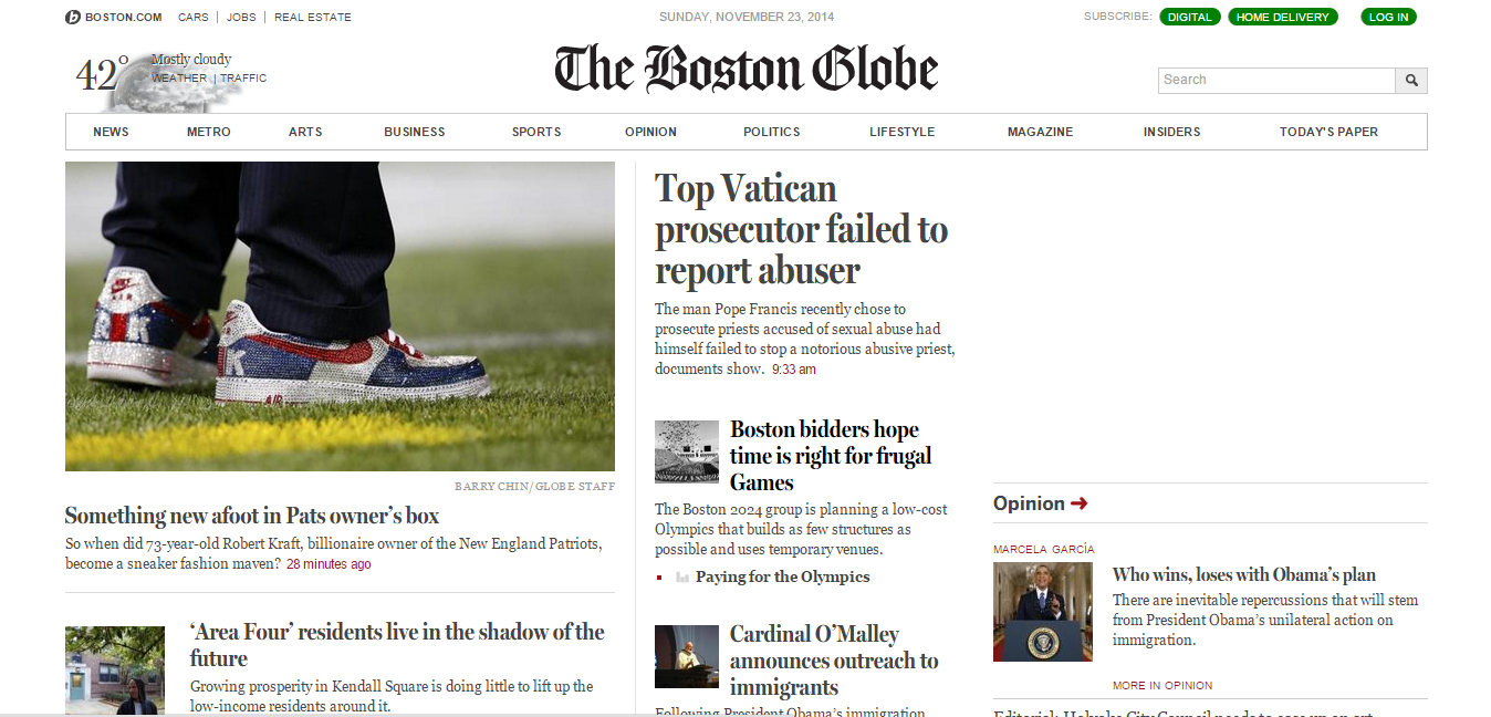
This was one of the first big websites that converted to responsive design more than 3 years ago. When you look at it on your desktop, you will not notice anything new about it, because it looks like a lot of other news websites. Adjust the window size with your pointing device and you will see how the design magically changes, while still being very functional and highly readable.

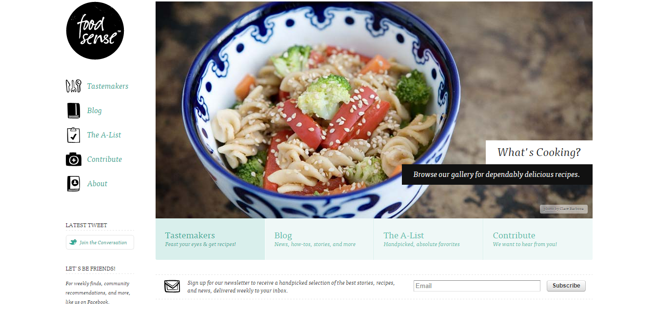
Another popular website with foodies and chefs, Foodsense is one of the best exponents of responsive design. With a full blown desktop, you see all sections neatly arranged in a horizontal arrangement. However, when you view it on a mobile device, the same page:
- Turns sections into small links that are easily clickable
- Changes its horizontal and grid orientation to a vertical one
- Pushes the less important parts of the page to the bottom
The most important thing to notice here is that all the links are still visible on the same page, but their appearance has been altered. This is the same code that is running on two different devices, but their appearance is vastly different, optimized for the device it is being viewed on.

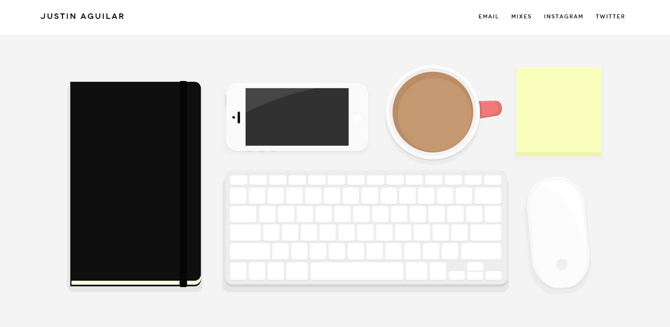
The most important feature of this website is that it is minimal in its designs. This allows the content to reflow more easily and fit into even the smallest of screens in smartphones. Here is what is notable about the design though:
- The images scale smoothly as the window or screen size changes
- The grid displaying features and services turns gets compacted with smaller images on the left and the names in the right
Images do not look blurry or difficult to understand even when they are scaled down dramatically

This is a website designed by design consultants for their own business. It will naturally have some serious thought put into it. What you will notice here is:
- The website is mobile first
- Even on a small screen, the content seems openly spaced
- On a large screen, the content expands to take advantage of the screen width
- The blue and white alternating sections make it easier to read and is easier on the eyes
If you are trying to design a website for a services provider whose main focus is creative design, you can’t get a better source of inspiration.

This is a branding agency, so they need their website to look hip and modern. The design for this website is far removed from the type of corporate sites that you see for businesses. It has a very colourful and animated design. Changing the window size and watching as the website changes form is pure inspiration for designers. Notice how:
- As the screen size comes down, the inverted triangle in the background narrows down to fit the screen completely
- As you scroll down, the sections are designed to be flexible
This is easier to achieve because there is little to no text on the web page, but the results are still very inspiring.

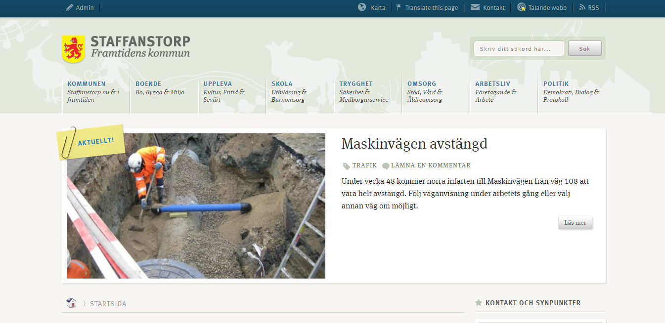
This one looks more like a regular website, but the most important aspect of this site is its typography. Even on very small devices, the text is very easy to read and in fact more pleasing to the eyes. It’s light and relaxed theme has a lot do to with it, but if you want visitors to stay on your site, you need to pay attention to how text changes with the screen size. You want the site to look equally good on mobile and desktop devices without feeling cramped on smaller screens.
There are hundreds of responsively designed websites on the web, but these are the ones that catch the eye and will motivate you to create beautiful responsive sites of your own.
About the Author
Rebecca likes to write marketing content and has experience in core marketing. She works for TopReviewStars, an online essay service review provider.
Leave a Reply