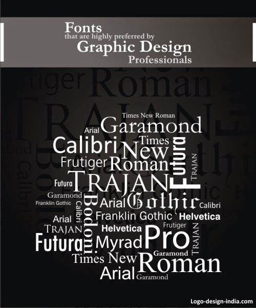
Typography holds crucial importance in the field of graphic design. Consistent use and careful selection of a selected font is equally as important as images, colors and graphics that are used to create and solidify a brand. By selecting the appropriate font, it is possible to fit a specific style or evoke a certain emotion which is crucial for the success of a business. Typography when skillfully used can catch the attention of the audience, motivate them towards taking action as well as helps to communicate the core idea. Even though, there are numerous fonts available for graphic designers, the following are some of the most preferred and widely used fonts by graphic design professionals.

Trajan
Dating back to late 1980’s, this font was designed for Adobe by Carol Twombly. This elegant type face is ideally suited for display works featured in posters, billboards, magazines and books. Those who are Hollywood movie fans must be well-acquainted with the Hollywood movie posters using this typography.
Helvetica
Graphic designers all over the world have a fascination and preference towards this highly popular font. This timeless, professional and distinctive typeface was created by Max Miedinger in the year 1957 and has been able to maintain its popularity since many years. Inspired by the grotesques of late 19th century, the design of this font features a certain kind of versatility that instantly makes it the favorite choice of designers.
Futura
The Futura font can be commonly observed in logos, large displays, books and corporate typefaces where small text happens to be a crucial element. This ancient font which is based on different types of geometric shapes like squares, triangles and circles, creates an appearance of forwardness and efficiency making it the preferred choice of popular brands like Absolut Vodka, Ikea and Volkswagen.
Garamond
Out of the numerous versions of the Garamond font, the Adobe Garamond font happens to be the most widely used which was released in the year 1989. The best part about this font is that, it conveys a feeling of consistency and fluidity. For print applications, the Garamond font is highly preferred as it tends to use less amount of ink as compared to Times New Roman and is easily readable.
Arial
This Sans Serif typeface consists of numerous styles such as Medium, Italic, Regular, Bold Italic, Bold and many more. Its easy readability at both small and large sizes makes it a great choice for office communication, advertising and book design. Apart from that, this font is also used in various types of logos as well as informational materials like instruction manuals, educational aids and booklets.
Bodoni
Bodoni is no doubt a wonderful choice for logos, decorative text and headlines. Designed in the year 1798 by Giambattisa Bodoni, Bodoni is generally known as a “transitional” typeface. This font has been used to design logos of different powerful fashion houses all over the world like Calvin Klein, Giorgio Armani, Guerlain and more. Some of the special features of this font include its flat, unbracketed serifs and narrow underlying structure.
Frutiger
Adrian Frutiger is the name behind the creation of this attractive typeface. The subtlety and warmth associated with this font helps it to be easily used in informative materials like booklets and magazines. On top of that, Frutiger font is also used in the logo of Telefonica O2, British Royal Navy, Raytheon and DHL.
Though, this list showcases some of the most popular fonts among graphic designers but, there are quite a few others that can give these fonts a tough competition like FF DIN, Gills Sans, Bembo, Franklin Gothic and more. Typefaces are similar to artifacts that can turn out to be functional and aesthetically pleasing at the same time and only an experienced graphic designer can understand the true value of a typeface.
Author Bio
Sarbani Sen is the graphic design team leader at Logo Design India and in this blog she has shared her knowledge about the various typefaces that are commonly preferred by graphic designers.
Using the right fonts certainly creates a soothing visual effect for the viewers. A well written blog with good writing skills! Thanks for sharing and best of luck for the future.
Thanks For the Comment. If you have used any awesome fonts, you can share the list with us.
Great post. I have read this type of blog for the first time. Keep sharing.
Nice one. Keep sharing.