Actually it’s difficult enough to create an effective and remarkable brand design, let on my own restrict oneself to the use of typography by myself. However, ceaselessly getting down to the bare essentials is the place probably the most remarkable options and sensible ideas emerge.
Infrequently it’s a fantastically concept out ligature that nails it, or an creative use of letters. At different instances it can be artful use of colour, scaling or re-arranging of letters and even subtly removing one thing from the logotype that gives it a twist of brilliance. So for your Inspiration, we have gathered these typography only logo designs that uses only Fonts. Check them out…
No Doubt
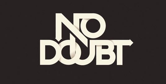
This is quite interesting logo design in which a path or way like structure is used.
Regional Arts Victoria
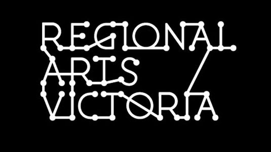
Regional arts victoria is a nice example of typography only logo design.
Hotel Cocoa

The Silver Brown Dance Co
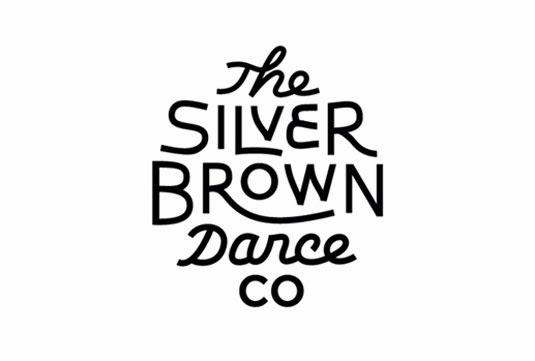
In this logo design the designer actually tried to adjust the alphabets in order to get the above shape.
Trafiq
Awesome use of a bold font.
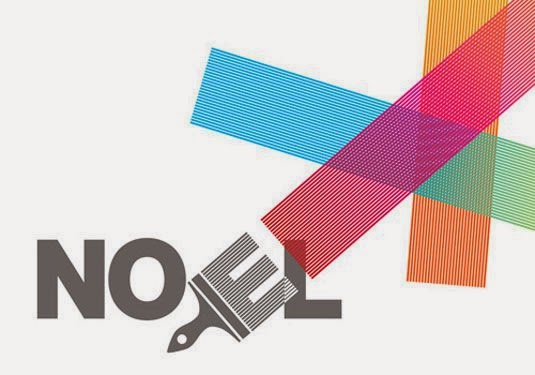
The brilliant use of a paint brush at the place of ‘E’ is made this logo design unique.
Infinite

Great example of how you can use symbols in your logo.
The Birdsong Trilogy

After staring at this logo anyone can say that this company is all about music.
Vitaremix


Guachy

Greenlots

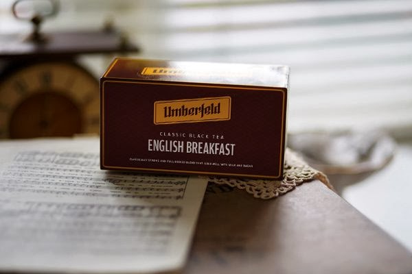
Umberfeld
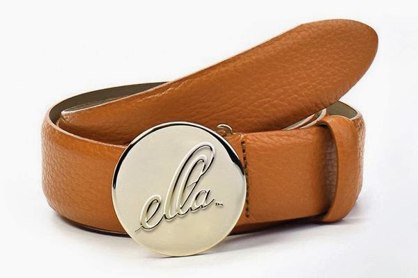
Ella
Higher



For which logo design you will vote?
All are Great Actually…….
All of them are great, but if I had to choose one it would be NOEL, it is by far the clearest on what they do.
Yeah Patrick, its a brilliant thinking of integrating a paint brush in E and that's why we included NOEL. Thanks for your comment and we appreciate it.