If your web design isn’t driving people to the right spot or isn’t converting – what are some of the things you can do to push people in that direction? Yes, you might know A/B testing entire new designs is possible, but perhaps you don’t have the time. Here are 10 things you can do right now to try to get that number of conversions up. You might also love to read a great web design guide on increasing conversions of eCommerce websites. So let’s improve your conversion rate.
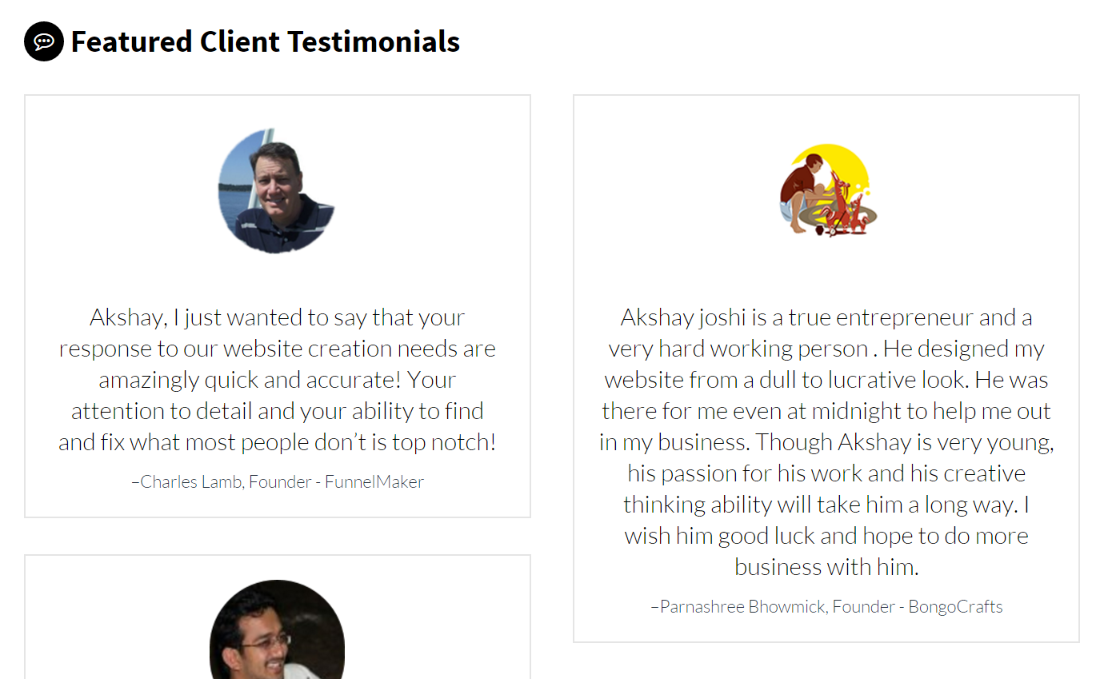
Testimonials are important

Add testimonials and pictures of happy customers around the site. People are much more likely to do business with you when they see real people have enjoyed working with you in the past, or have enjoyed your products. You may understand that your work is amazing – but people don’t have the same experiences as you, they aren’t going to psychically understand the value of your work, you need to spell it out for them with dead-simple testimonials. Check my own client reviews here.
Add Trust Badges
Add two or three trust badges around the site, particularly where you are wanting people to take a next action like contacting or going to the contact page – or placing an item in their cart.
HUMANIZE it
Take some time to HUMANIZE the key marketing messages you have and don’t let ‘corporate-ese’ take over and strangle the way your website is talking to potential customers.
Take Photography Seriously
Take some time and refresh your photography to be the closest thing to real, genuine people enjoying the benefits of your product or service as you possibly can. Consider the story of a successful interaction with your company and what that means for your customers. Consider the emotional impact you have on them, and try to demonstrate that through high quality and authentic photography. If you don’t currently have these photos – the next chunk of marketing money you spend should be on professional photography and it should be done under the careful creative direction of someone who understands your brand and what your brand means to customers.
Example from Oppsource – Sales Development
Have as many CTA as Possible
Add a full-width CTA (or call to action) section above the footer on every page. If you have a developer handy, have them develop it so it’s actually in the file for your footer so you don’t have to manually add it to every page. With WordPress or other CMS or a website using PHP, this will be relatively easy to a developer.
Simplify your contact form
Take away a couple fields from your contact form – if you have only 3 this would obviously not be practical, but if you have 10, consider that people might be too much in a hurry to give you every last detail of their lives just to be able to talk to you. It may make it easier on you if they give you all that info, but the current state of the world is such that if you need more leads / if you really want your conversion rate to improve, you’re going to need to ask for less out of the gate. Consider having a pre-made e-mail written and ready to send with the next 3 questions – there’s nothing wrong with a two-step approach.
Create Urgency
Create some kind of urgency with an indication that your product or service has a limited quantity or stoke the feeling of scarcity in some way. People use countdown timers, limited time pricing, or an indication that they only have 2 or 3 slots left in the next couple months if they are selling services to push people to make a decision NOW.
Example from Shopify’s “Ways to Create Urgency”

Leave a Reply