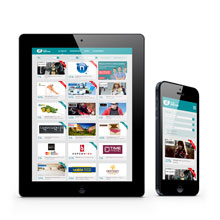
Within the cooperation between Symetria and Credit Agricole, the agency has developed two websites – “Discount Club” and “Join Credit Agricole.” In both cases Responsive Web Design was applied and assured optimization for all screen sizes.
Symetria Challenge
“Discount Club” is a page presenting partners of Credit Agricole and discounts which are provided by them to the bank customers. “Join Credit Agricole” is aimed at new customers, and its main purpose is to encourage visitors to open an account in the bank. Although the users’ needs in both cases are different, in each case the agency’s task was to provide solutions maximizing websites’ usability. In accordance with the current trends, it was found that Credit Agricole website is more often visited by people using mobile devices. Therefore, Symetria challenge included development of the websites that will provide an optimal viewing experience.
Selection of the mobile strategy presence
Symetria experts involved in the project unanimously recommended Responsive Web Design approach, which enables to create solutions for all sizes of screens (including even those appliances, which are not available on the market yet).
– Nowadays, responsive websites are more often standard solution, rather than just a curiosity. When we create projects such as Credit Agricole, our goal is always to provide great experiences for all users, regardless of the size of the screen they use – says Andrzej Pyra, UX specialist in Symetria.
Consistency of marketing communication, the better effectiveness of the website in search engines (responsive website is available on all platforms under a single URL) and cost optimization (single solution instead of several independent) were also important arguments to choose a RWD approach.
Project implementation


New responsive designs enable working efficiently on touch screens and provide quick change the screen orientation.


Another important element of the design process of responsive websites was to plan which items would be available on larger screens (e. g. expanded graphics) and how the structure of the layout components would change.


On these screens we are able to see: changes of the main menu display, change of the “switch account” button location and presentation, scalability of the graphics and the main message, different presentation of the process of transferring the account.
Effects
The most important advantage of the websites designed by Symetria is their availability for all clients of Credit Agricole, regardless of the device they use. Pages automatically react to the size of the screen on which they are displayed, and thus allow users to freely explore their content.

Improvement was reflected in the statistics. Looking at the data on the “Discount Club” website for the period 24-28 August 2012 (before the change) and December 14-18 2012 (after changes) we can see a significant increase in website performance indicators. Comparing these periods, traffic from mobile devices has increased by 200 percent, which amounts to 10.5 percent of all views. There was also increase in the number of views by 664.25 percent and visits by 216.73 percent. Average duration of visits has increased by 161.45 percent and bounce rate has decreased by 57.94 percent. The latter refers to the situation when a user finishes the visit immediately after entering the site. Almost 60 percent decrease in bounce rate indicates an increase of the interest in content on the website, as well as interest in the Credit Agricole brand.
About Symetria
Symetria provide comprehensive e-business & user experience services. Since 1998 Symetria experts work with the largest Polish and international companies. Symetria also run own online projects (Sympatia.pl, Vitalia.pl and Trener.pl).


Leave a Reply